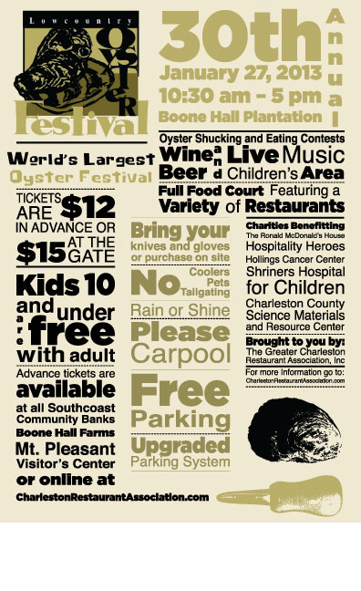
2013 Oyster Festival Winning Poster

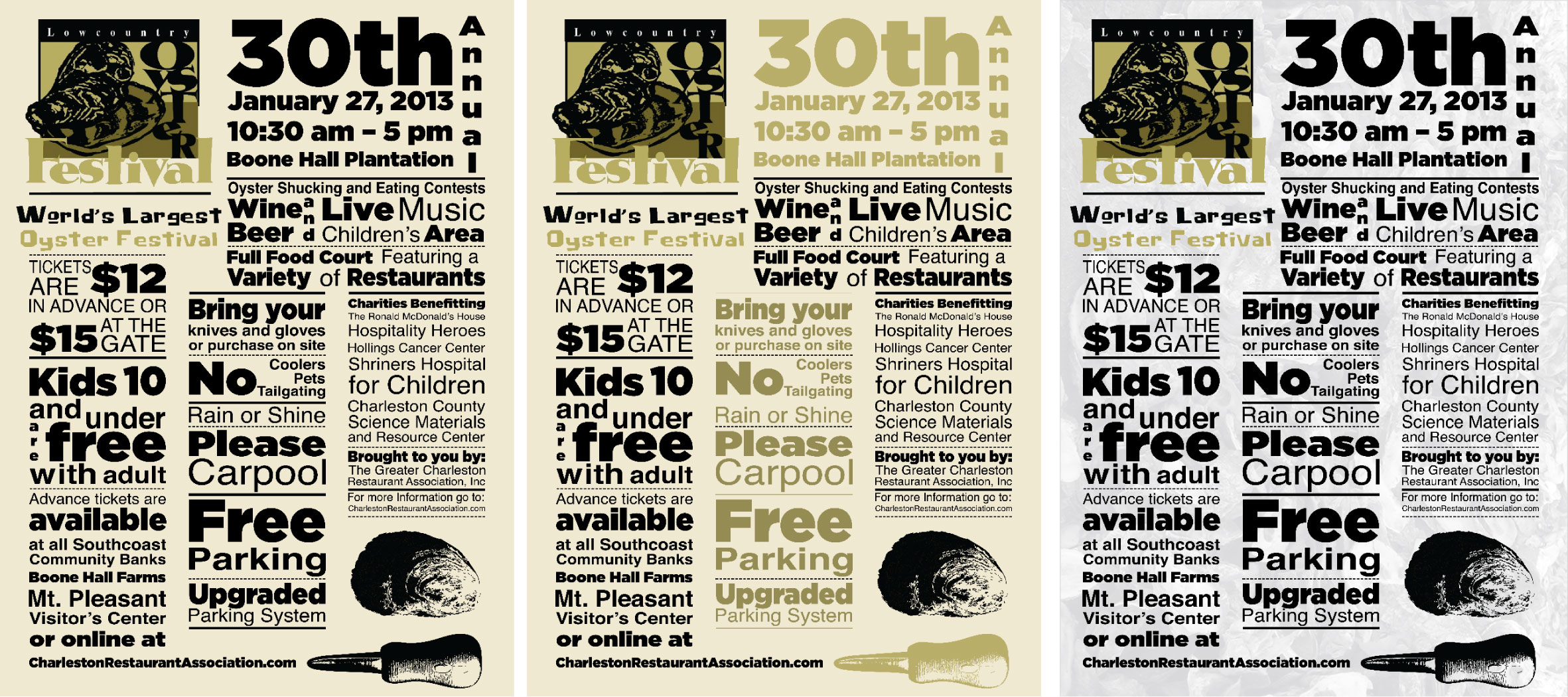
Winning Poster and Alt Designs

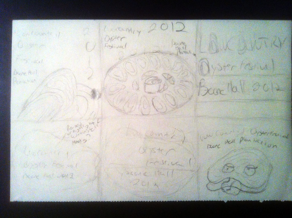
Thumbnail Sketches

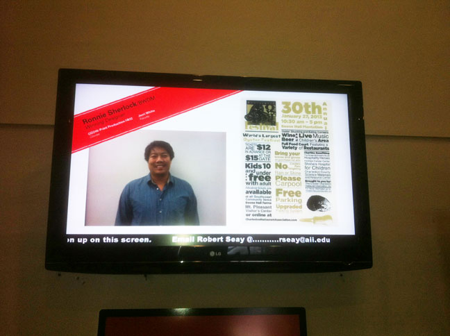
School Recognition

Class & Real World Assignment: 30th Annual Lowcountry Oyster Festival Poster
BACKGROUND:
I recently won the contest to design the poster for the Lowcountry Oyster Festival and the reason my design won is because of the things I’ve learned here at the Art Institute of Charleston. The first thing I learned is, listen to your instructor because they have experience and perspectives on good design. My instructor Jerri White, gave me some great ideas for the poster. She commented she was curious how the oyster festival would look in type. I sketched one of my thumbnails in a type design as a result, which I would eventually use.
And she also commented after looking at the posters of the past winners of the contest on how they used three columns of event information in their art design in which I also later incorporated into my poster design. I also followed the C.R.A.P (Contrast, Repetition, Alignment, Proximity) design principle I first learned from Chad Treado’s class.
I used two different typefaces to contrast from each other and to lead the viewer to the message on my poster. I followed the same rules I set for myself throughout the poster such as when I increased the size of words in one area of the poster I did it throughout and only for words. This repetition throughout my design gave it consistency and flow.
I used guides as borders for my three text columns and header for proper alignment. This made my poster easy to read. And finally, I put similar information in close proximity to each other and gave distance to separate key points. This made my poster look professional and organized.
The next thing I believe helped me win the poster is to pick up on cues from the client. I looked at the colors from the logo of the Charleston Restaurant Association (the client), the Boone Hall Plantation website and used both in my design. Looking at past poster winners, I also surmised the client valued event information on the poster more than fanciful artistic designs and I emphasized it when I decided to use a type design. It also helps make variations of your design. I had three variations and they picked my second one (middle poster) that used a text contrast for the header and middle column.
I know I won because I listened and learned from my instructors, followed the C.R.A.P. principle of design, picked up on visual cues from the client and produced multiple variations of my work. My poster was displayed at all SCCoast banks around the greater Charleston area. I was awarded $300.00 for my efforts. The poster had informed thousands of people who attended the event, raising money for charities and 80,000 lbs of oyster were consumed and everyone had a good time!